Egg
Visual Identity
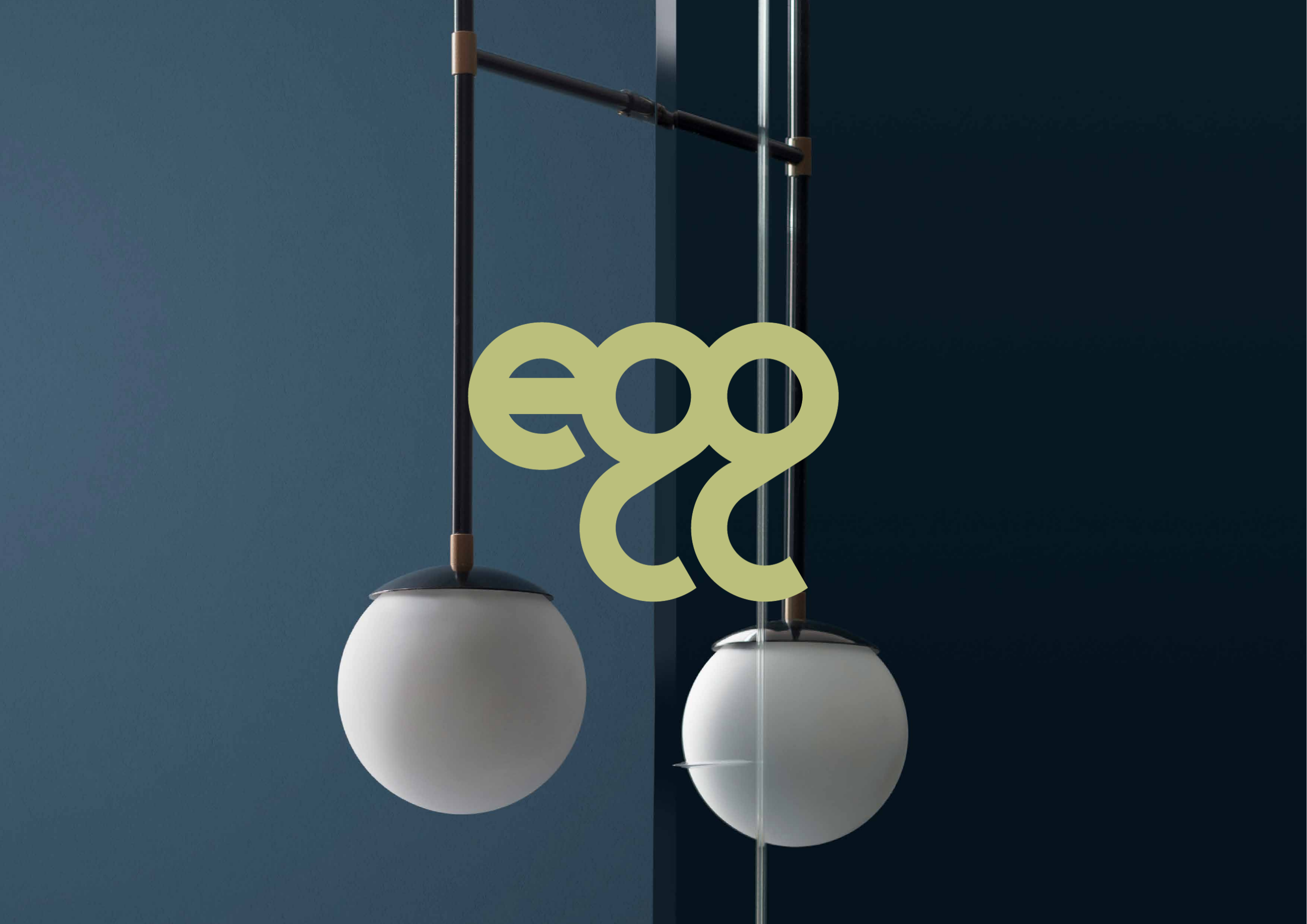
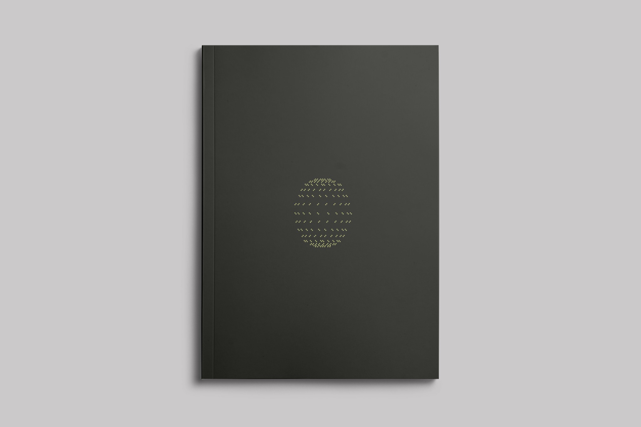
Egg is a collective of interior designers and architects, each bringing their own perspective while working and collaborating within a shared framework. The identity explores the balance between individuality and structure, expressing collaboration as a design process rather than a stylistic outcome.
Logotype
The logotype was custom-drawn from a geometric grid. Its continuous form reflects different practices coming together within a single identity.
Payoff
“easy, great, genial” extends the identity into language, with the initials e–g–g echoing the name itself.
Visual System
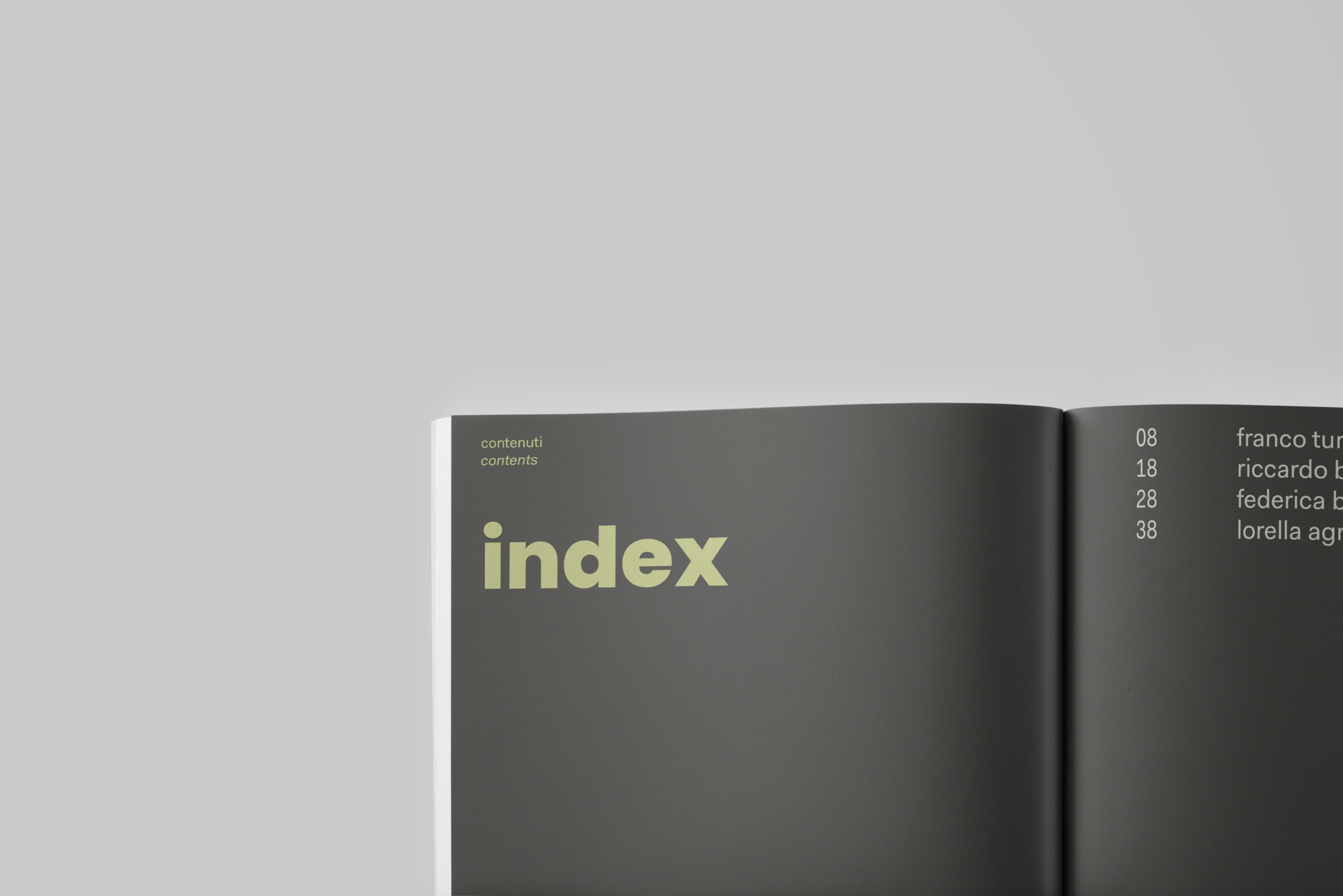
The egg shape is reduced to a geometric grid and reconstructed as a field of points. This modular device extends the identity through repetition and rhythm. The palette combines deep graphite, expressing structure, precision and materiality, with a soft yellow-green that introduces warmth and a more organic quality. Together, the two colours balance rigour and openness.
Editorial design
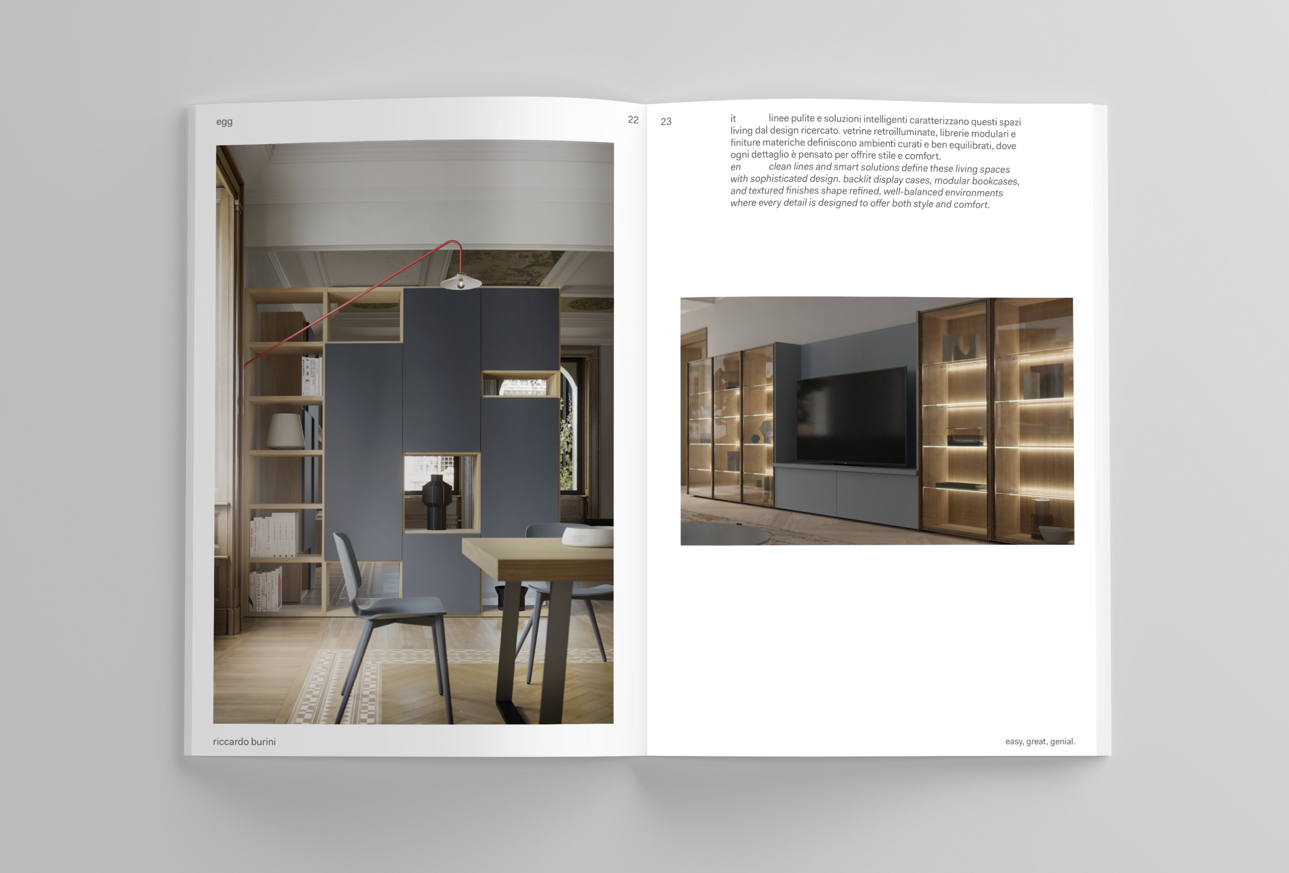
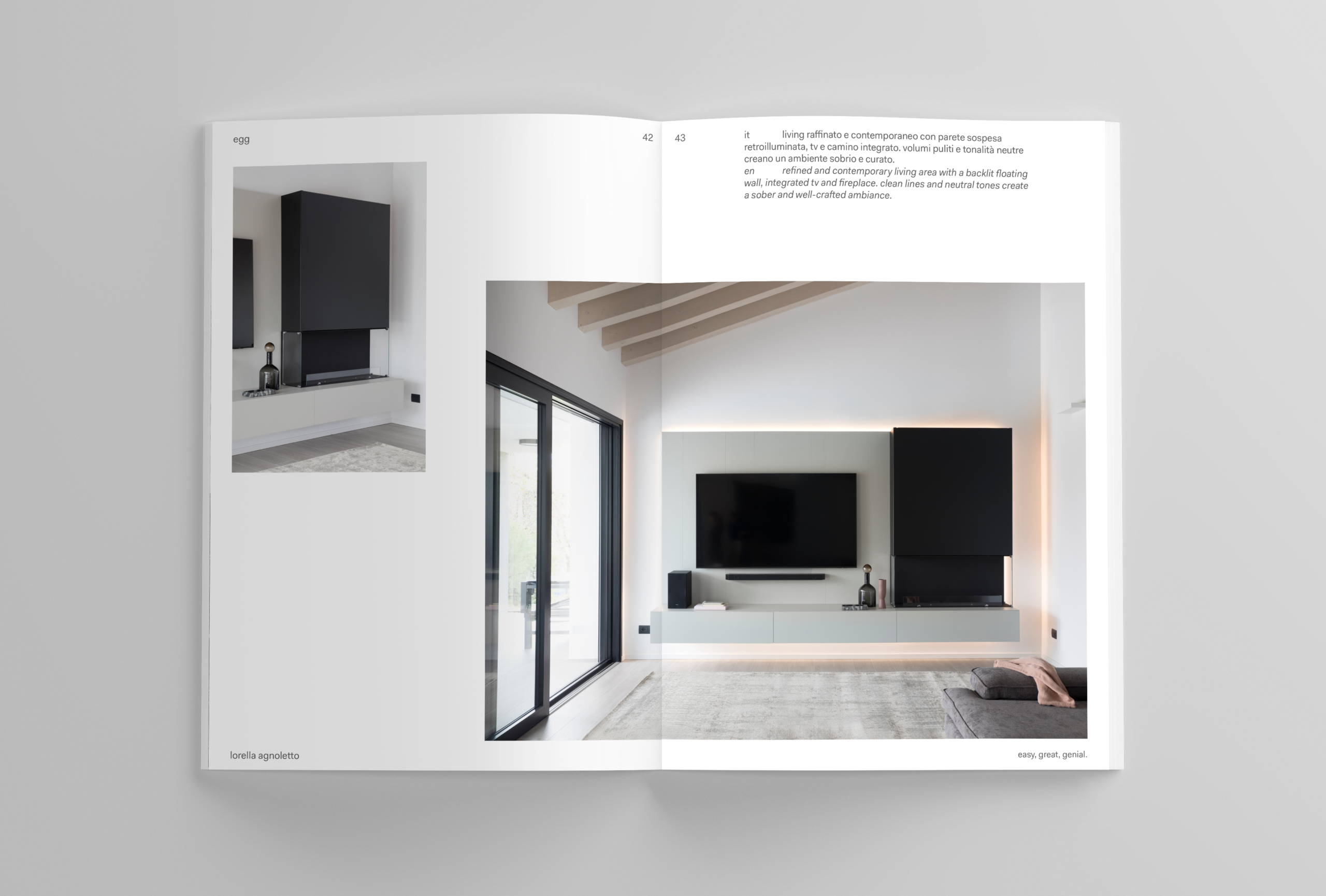
The brochure uses generous areas of white space, allowing the images to lead the narrative. Each image is given room to breathe, guiding the reader through the project and creating a measured visual rhythm.